Notification Inbox
A new channel for personalized messages in product.

Background
My team decided to explore how notifications could help our users find deals, and promos in one place in addition to email campaigns, and onsite marketing. We followed the structure of Sprint, by Jake Knapp and delivered a workable prototype to existing users in 5 days. Following the sprint, I continued as lead designer and saw the project through to launch and collaborated with product, tech and data science to deliver a workable MVP on schedule.
Problem
Users needed a way to keep track of promos, gift card balances, new restaurant alerts, and other notifications so they wouldn’t miss out on anything Grubhub had to offer.
Team
Myself (Designer)
Leah Olverd, Jia Liao (Product Managers)
Richard Chen (Research)
Designs
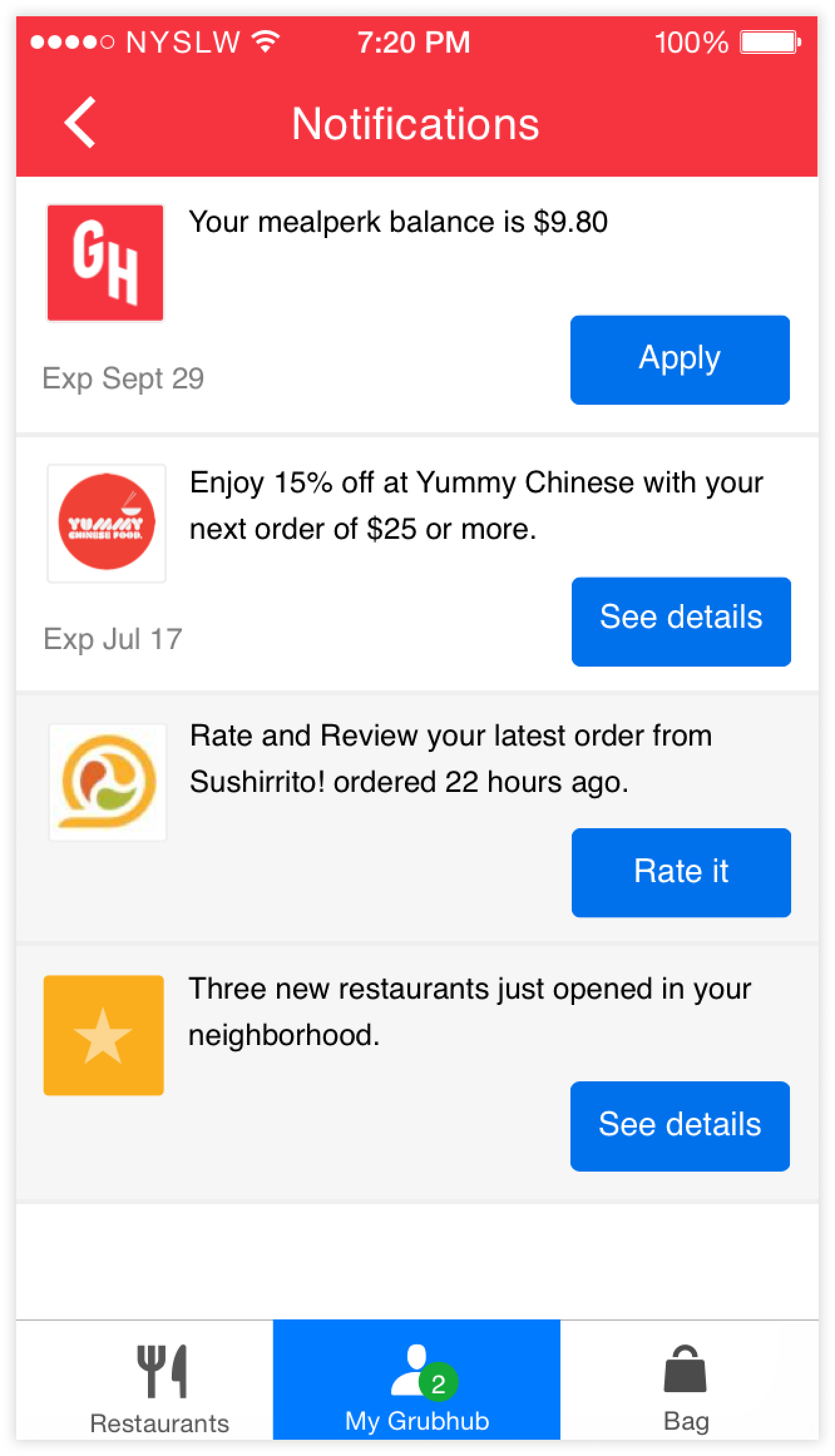
Because the inbox lives within the 'My Grubhub' tab, a trail of green badges leads the user to their personalized messages. Follow the badges to the inbox where you'll find a list of messages currently organized by date and time. Each message is actionable, taking the user further into the app (e.g. opening a dialog with detailed information about a promo.)
Research & User testing
Before arriving at the final design we explored an alternate concept: "My Updates." Since we decided to house the inbox in My Grubhub, we tested the idea of leveraging tabs to create parity between My Grubhub and Inbox content. This storyboard helped us plan and outline the content for the initial prototype. Our research questions:
Would people expect to find My Updates in My Grubhub?
Would they understand where to find different message types like track your order or promo codes?
How could we surface messages outside of the inbox?
We tested the first version shown in the middle with 5 users. We prompted them to find a new restaurant, Super Salad, that had just opened in their area and place an order. During testing we learned that 3 out of 5 users didn’t understand that these were notifications within My Grubhub. This led us to believe the formatting of the notifications would likely need to be revised. There were also issues with finding notifications in the first place even with the red badges leading them there, and understanding what “My Updates” means in comparison to “Order Activity.”
The screen all the way to the right was the second version we tested with users, which validated that “Notifications” was the right language for this tab. However Users were still not understanding the difference between the two tabs, and found that the information repetitive, even though it was different content.

Sketches
After the initial testing, we found that the My Updates tab wasn't applicable for every use case. I returned to the idea of housing messages within an Inbox (in My Grubhub), and explored different ways of organizing the content.
During a series of timed sketching sessions I explored the idea of having categories to separate notifications.
I landed on the final design of the inbox while figuring out the flow for how promo codes could be redeemed. This led to using full screen dialogs for additional information and secondary actions, if the notification itself didn't lead users to a new page.